Redesigning the Arcus mobile app
A very short case-study.
Arcus is a hyper-local weather app for Android. Much like Dark Sky for iOS, it uses your phone's GPS to predict when it will rain or snow at your exact location, down to the minute. It's pretty sweet.
Unfortunately the design isn't great:
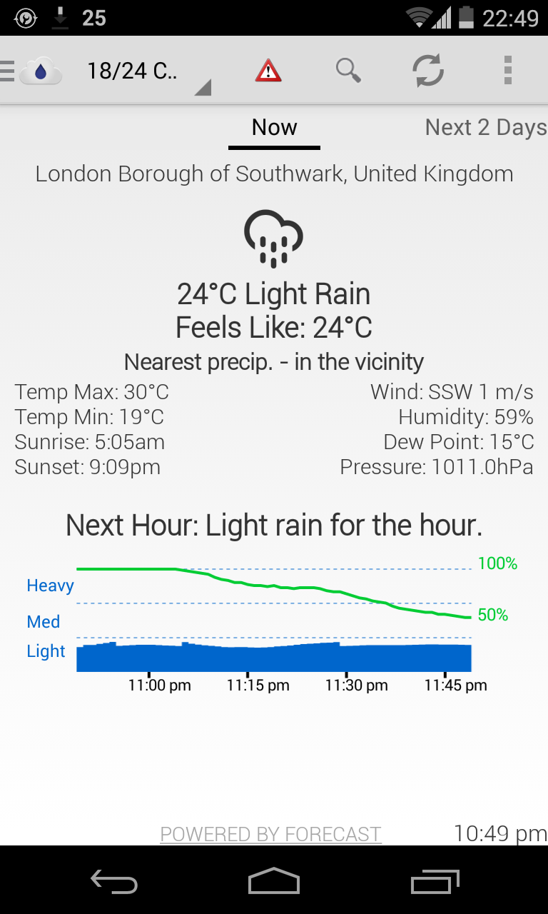
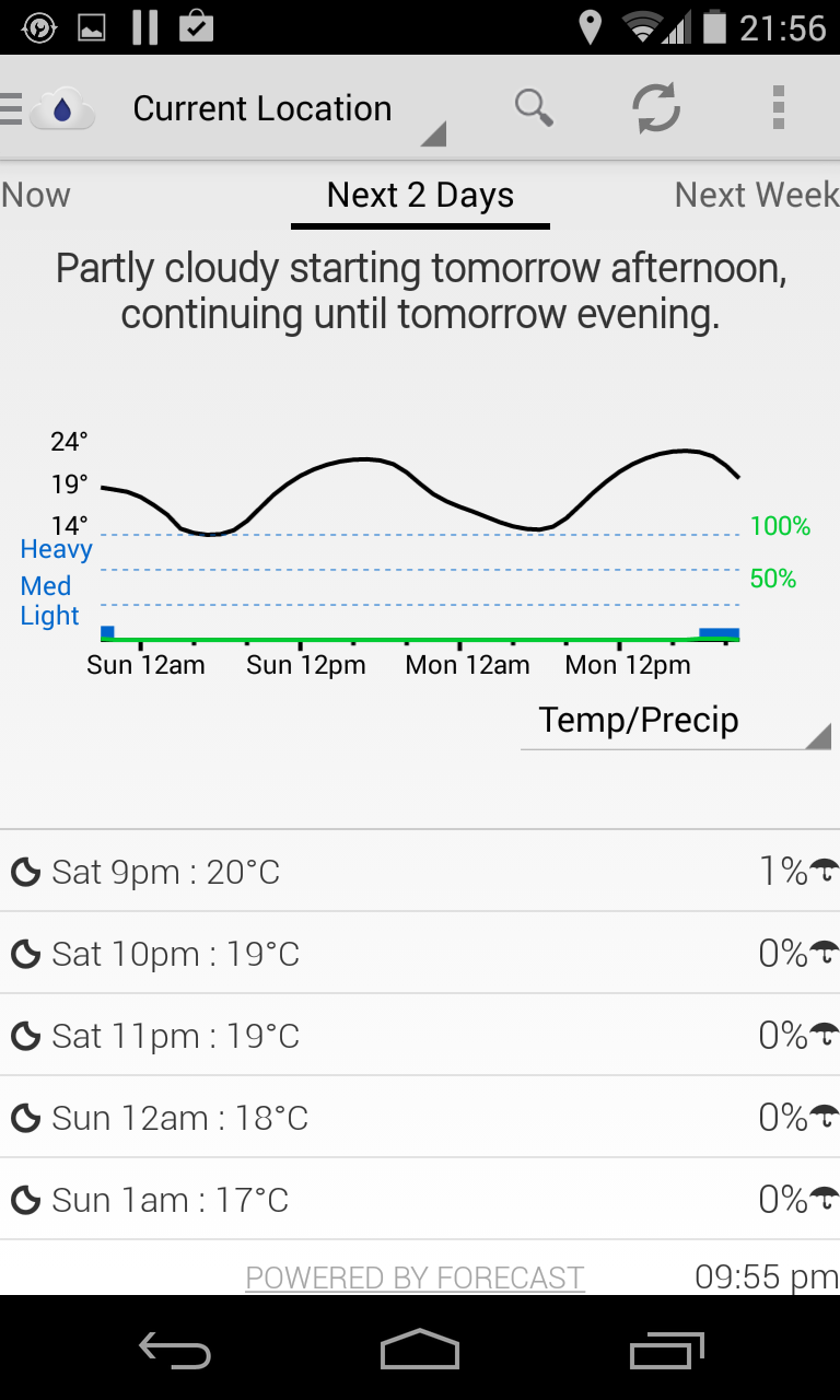
While the graphs are useful, the tightly-packed text and lack of an obvious visual hierarchy makes it difficult to scan information quickly. It has some great features though, so I started using it as my go-to weather app, while quietly hoping that Dark Sky would bring out an Android version. When that appeared less likely, I decided to suggest improvements for Arcus instead. One evening when I was feeling creative, I emailed Arcus's creator Kushan Jayatilleke, and offered help with redesigning the app. Kushan happily accepted. After a few hours of playing with the design, this was the result:
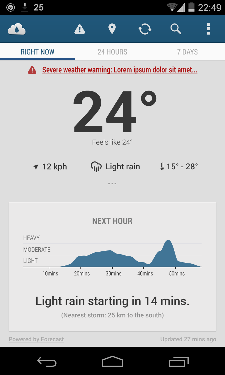
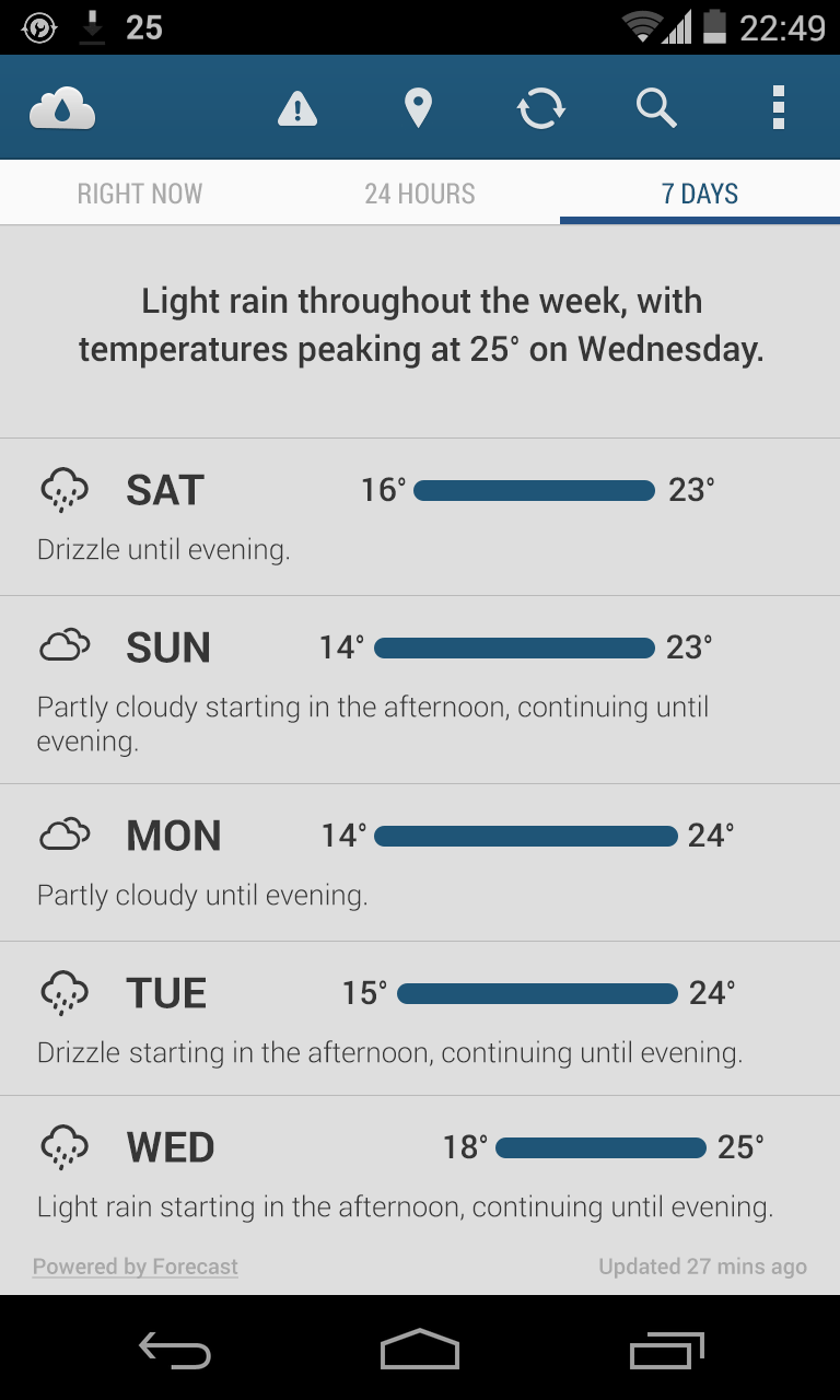
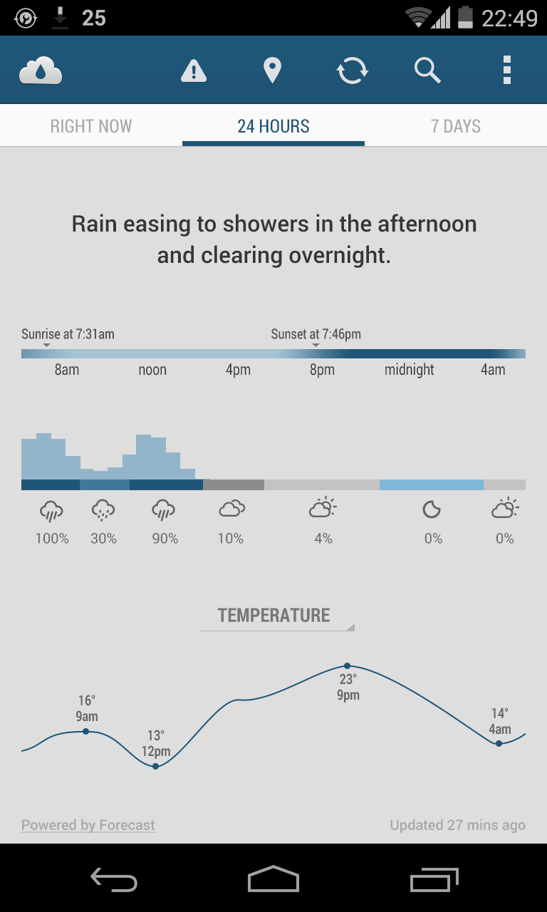
I didn't spend a lot of time refining it because the project was pro-bono and unsolicited, so I'm still not completely happy with many aspects of the redesign. Ideally, I'd spend more time creating alternate versions and user-testing to see which aspects are might be confusing. However I'm fairly happy with the new design as it stands. I think that it simplifies the text-heavy interface, and makes it easier to pick out individual pieces of information at a glance.
Kushan was happy with the new layout and began revising the app's design over subsequent weeks. While he didn't implement every aspect of my design, he did use many of my suggestions, and I think the app is easier to use and more visually-appealing as a result.